The color gamma of your interior not only creates room esthetics, but also is capable to influence mood of the people who are in it. Therefore when it comes to coloring of walls, not superfluous will be to study certain characteristics of flowers. It will help to avoid mistakes and guarantees the comfortable atmosphere in any room.
Do not use red color in the bedroom
Photo: Magda Ehlers/pexels
Red can be in your favourite color. But even in this case it does not have the place in the bedroom. Red color causes rather strong emotional and physical reaction in the person. The fact is that we subconsciously associate it with danger. And it, in turn, is capable to cause tachycardia and it is bad to affect dream.
Violet color can cause nightmares
Photo: cassidy muir/pexels
Violet it is also possible to refer to colors which are least favorable for use in bedroom interior. According to the world's largest network of motels Travelodge, the dream of the lodgers who have chosen for rest of the room with violet color of walls lasted less than six hours. Besides, this shade is considered psychostimulator and therefore it is capable to cause nightmares.
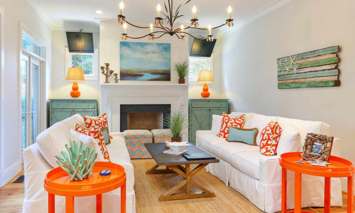
Be careful at registration of the living room in brown tones
Photo: Dalila Dalprat/pexels
Some shades of brown can quite decorate the living room. But in most cases this color does space too dark, sad and, certainly, reduces it. Anyway, when it comes to dark shades in interior, it is necessary to be very careful.
White walls not for study
Photo: Pixabay/pexels
White color is very good for small rooms. It visually increases space and creates feeling of cosiness and freshness. However, if it comes to registration of the worker office where you spend the most part of the time, it is better to refuse completely white walls. This color leads to tension and fatigue of eyes, especially in conditions when the person works the whole day at the computer.
Avoid dark shades gray in kitchen
Photo: Stephanie Ho/pexels
Undoubtedly, gray is one of those flowers which allow to turn the most courageous interior decisions into reality. But use of dark shades gray in registration of kitchen, especially small sizes, can make space too monotonous, cold and even depressive. Therefore do not forget to dilute it with warmer colors.
Pink color in interior: the main thing is not to go too far
Photo: Megane Forbes / pexels
In terms of psychology, the love for pink color is characteristic of pensive and gentle natures. This color promotes relaxation, neutralizes aggression, creates feeling of comfort and perfectly will be suitable for creation of bright accent indoors. But, using pink it is important to observe sense of proportion. The surplus of bright tone not only will lead to feeling of excessive sweetness, but also will break the general esthetics of the room.