The combination of flowers in interior of the room does not submit to strict rules. More likely, this whole art. Style of kitchen as, however, and all apartment or the house, everyone chooses according to own taste and way of life and also with preferences of other family members. If it is correct to choose color scheme, having competently grouped colors and shades, the kitchen can become stylish or cozy, strict or impudent, everyday or festive.
By means of color it is possible to increase or reduce visually the room, to correct unsuccessful form, to give desirable emotional coloring. For example, if in kitchen low ceiling, its upper part it is better to issue in light tones, having created illusion of high ceiling. The light color gamma is preferable to small rooms, it will help to increase them visually. Dark and bright shades will be suitable for too wide kitchen more. They will make it cozier.
Achromatic interiors
The interiors executed in white, gray or black tones carry the name achromatic, and having color tone – chromatic. Purely achromatic interiors of kitchen meet rather seldom. Psychologists consider similar color schemes extremely unsuccessful and negatively influencing human mentality. For example, the snow-white kitchen looks too sterile and reminds hospital. Gray can plunge the person into depression, and black makes oppressive impression. However black color is well combined with white. Especially effectively the black and white tile which is laid out in chessboard order looks. If the interior is executed in gray tones, it is possible to add to it green accent. The room will gain much more sunshiny disposition at once.
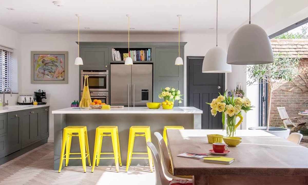
Chromatic interiors
It is more difficult to develop color scheme of chromatic interior, at it there can be combination of large amount of colors and shades. At first the main color is chosen, and then additional are added to it.
The monochrome or one-color interior represents combination of shades of one color. For example, for the kitchen solved in blue tones it is possible to use shades from celestial-blue to dark blue. The more shades, the interior will be more interesting to look. Besides, any monochromatic combination can be added in white or silvery color. So-called analog or adjacent colors are well combined in interior. They are selected by means of classical color circle. At first the main color is chosen, and additional are 2 his neighbors on the right and at the left. For example, for blue similar neighbors will be blue-green and blue-violet, for red – red-orange and red-violet, etc. Also by means of color circle it is possible to choose contrast combinations of flowers. Only now it is necessary to pay attention not to standing nearby, and to opposite colors, for example, red and green or violet and yellow. The contrast interior demands observance of one more rule – color of furniture has to be lighter than floor, but is more dark than walls. However the interiors executed in contrast tones can quickly tire or bother. As option, it is possible to use contrast color only in easily replaced parts. Many experienced designers consider that it is possible to group successfully even the most incongruous colors. The main thing is to pick up correctly shades, and at every color there is a lot of them.