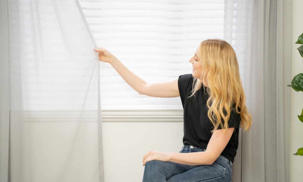
The last stroke in interior of any room – harmoniously picked up curtains. They have to approach completely on style and fit into design of the room. In good selection of different curtains, curtains and curtains it is possible to get confused easily to choose suitable option, it is necessary to consider all nuances.
Interior style
When choosing curtains the style of interior in the apartment is of great importance. Indoors everything has to be harmonious, same concerns also decor objects. You should not choose heavy portieres with silk brushes and numerous draperies for interior in style Provence or country. As well curtains with flower print will not be suitable for style minimalism with laconic furniture and monophonic wall-paper.
For modern style monophonic curtains from mixed fabrics, and well will be suitable for Baroque style – curtain with large number of jewelry, flounces, fringe and frills.
Color gamma
Curtains and wall-paper have to be combined among themselves on color, however you should not choose one tone and for this purpose, and for another. Color of curtains directly depends on wall palette. Adhere to the same shades, but choose lighter or, on the contrary, dark for curtains. For example, curtains of saturated violet color perfectly will be suitable for the room with lilac wall-paper.
Do not overload the bright room with the same saturated curtains. Otherwise to you will uncomfortablly be in it. Curtains of pastel tones will relevant look. Use decorating reception. Many designers at selection of curtains to wall-paper follow the principle: the color of walls is brighter, the more quietly there have to be curtains. Curtains with various decorative elements, for example, holders, rings, clips and intricate pattern will approach monophonic wall-paper.
Color combinations from the surrounding nature
During planning of color saturation of the room take in attention of color which meet in the nature. They are easily remembered and quickly are associated. Examples of combination of palette: • combination of day and night; • sun and grass (yellow and lime colors); • contrast of the night sky and stars; • coast combination – sand and the sea. Analyze all combinations and safely use them in interior. Involve in it no more than three different flowers. Follow one direction, for example, at combination of fiery shades use yellow, orange and red.
Invoice of fabric
The invoice of fabric is of great importance. It is much better if she repeats the invoice of upholstery of upholstered furniture and other elements of textiles indoors. Certainly, it is not necessary to order curtains and upholsteries from identical fabric, however, they have to be combined among themselves and be in harmony with wall-paper.
Universal option
Neutral colors (cream, beige, sand, peach, terracotta and gray) will approach practically all wall-paper. It is possible to add suitable accessories to addition, for example, of pillow from the same fabric.